Streamline Your Data Processes - Start a project!
Get customized solutions for your business - Try Our Services Today!
Streamline Your eCommerce Operations - Try Our Services Today!

10 Website UX Mistakes That Are Costing You Clients (And How to Fix Them)
What if a potential customer lands on your website, excited about your products or services? But within seconds, they're irritated by slow loading times, confused by terrible navigation, or just overwhelmed by a messy design. Millions of such situations play out across the Internet daily, and it could be happening to your business right now.
Your website is like your digital sales counter that works 24 hrs to attract clients. But many businesses hurt their success through UX design mistakes that send customers straight to their competitors. The reality is harsh, 88% of people will not return to a site if they had a bad experience with it.
Today's users want fast, easy websites. When your site doesn't deliver, you lose more than one visitor—you lose future business, word-of-mouth referrals, and trust. The good news? Most UX design mistakes can be fixed once you know what to look for or partnering with the best website design company.
The Ten Biggest Website Performance Problems That Are Quietly Costing You Money
1. Slow Loading Speeds
Nothing kills user experience faster than a slow website. Users today expect pages to load instantly. Website performance directly affects your income. Every second matters when turning visitors into clients, and slow loading times are among the most costly UX design mistakes you can make.
The fix begins with reducing image size, selecting reliable hosting, minimising HTTP requests, and enabling browser caching. Compress large files, remove unnecessary plugins, and consider using a content delivery network (CDN) to serve your content faster worldwide. Regular performance checks should be part of your UX design strategy to keep speeds fast.
2. Mobile-Unfriendly Design
With mobile devices making up over half of all web traffic, having a mobile-unfriendly website is like closing your doors to customers. 68% of test participants quit their mobile browsing sessions due to avoidable usability issues, which means huge lost opportunities for businesses that haven't made their sites mobile-friendly.
Mobile users have different needs and behaviours from desktop users. They're often on the go, have limited time, and interact with touch rather than clicks. Consider these factors while creating your web design. Your site should be responsive and have touch-friendly large buttons, readable fonts, along with simplified navigation.
Test your site on different devices and screen sizes regularly so that you can identify and correct any issues of mobile usability before they take away your clients.
3. Confusing Navigation
Navigation is your website's roadmap. When it's confusing, users get lost and leave. Poor navigation structure represents one of the most fundamental UX design mistakes that undermines everything else you do right on your website.

source - speckyboy.com
Within three clicks, users should get to their destination. Navigation should be highly intuitive, consistent from one page to another, and clearly labelled. Do not use industry jargon or creative names that perhaps end up confusing users instead of helping them.
Implement breadcrumbs, search functionality, and logical page hierarchies. A well-structured navigation system is a cornerstone of effective UI/UX design that keeps users engaged and guides them toward conversion.
4. Visual Cluttering
Visual clutter is the enemy of good web design. When every element screams for attention, nothing gets heard. Users feel swamped with cluttered sites, cannot find what they want, and soon abandon the website in favour of cleaner, well-organised options.
Web design trends that work in 2025 will be very much about the clean and minimal approach with an emphasis on UX rather than flashy graphics. White space is not wasted space; in fact, it is a design tool that allows users to focus on what is important. Every single element on your page should have a defined purpose and should lead customers toward your designated action.
Use typography, colour, and spacing to establish a clear hierarchy that draws attention to key points. Get rid of the useless decorative elements, ditch the multiple font styles, and make sure that your core message is really noticeable. Remember, simplicity often converts better than complexity.
5. Weak or Missing Call-to-Action Buttons
Your call-to-action (CTA) buttons are where sales happen or don't. Weak, hidden, or confusing CTAs are critical UX design mistakes that directly hurt your income. A better UX design can achieve conversion rates of up to 400%.
Effective CTAs are easy to see, use action words, create urgency, and stand out from the rest of your page. They should clearly tell users what happens when they click and why they should take that action. Place them smartly throughout your user journey, not just at the end.
Test different CTA colours, texts, sizes, and placements for the best conversion rates. What might be working for an audience may not work for another; therefore, one has to make decisions from the data. Your UX design strategy should include regular CTA optimisation as conversions depend on these critical elements.
6. Poor Form Design
Forms are necessary evils on most websites, but poor form design creates unnecessary friction that costs conversions. Long forms, unclear labels, missing error messages, and lack of progress indicators all contribute to form abandonment and lost business opportunities.

source - hacker hero
Keep forms as short as possible by only asking for essential information. Use clear, descriptive labels, provide helpful placeholder text, and implement real-time validation to catch errors early. Break long forms into steps with progress indicators to reduce perceived complexity.
Consider the user's perspective, they're giving you their valuable information in exchange for something. Make that exchange as painless as possible through thoughtful UI/UX design that respects their time and effort.
7. Inconsistent Branding
Inconsistent branding across your website creates confusion and erodes trust. When colours, fonts, messaging, and visual elements vary randomly across pages, users question your professionalism and attention to detail. Consistency is an important principle of good web design that builds its credibility.
Set up a comprehensive style guide that specifies colours, typography, imagery, tone of voice and all the visual elements, and then apply them consistently and uniformly across every page so that your website feels cohesive and professional throughout the user journey.
8. Missing Search Functionality
When people are unable to find what they need through site navigation, they do so through search. Websites without search functionality or with poor search features frustrate users and increase bounce rates. This is particularly damaging for content-rich sites or e-commerce platforms.
Implement an intelligent search that provides relevant results, suggests alternatives for misspellings, and filters options appropriately. Include search autocomplete, recent searches, and popular search terms to enhance usability.
9. Accessibility Barriers

Source - ramotion
Accessibility is all about inclusive design that welcomes all types of users. If a company has an inaccessible website, it is excluding some customers who have disabilities. Some of the usual accessibility issues include 'bad' colour contrast, alt text missing for images, keyboard navigation problems, and a very unclear focus indicator. These are some major UX design mistakes that not only exclude users with disabilities but also may sometimes contribute to making a bad user experience for everyone else.
Implement semantic HTML, provide alternative text for images, ensure sufficient colour contrast, and test keyboard navigation. Accessibility considerations should be built into your UX design strategy from the beginning, not bolted on afterwards.
10. Lack of Trust Signals and Social Proof
Trust signals are vital to conversion in these times of online scepticism. Websites without testimonials, reviews, security badges, contact details, or professional credentials fail to build some credibility in the minds of their potential clients.
Make sure that relevant customer testimonials are present, like client logos, security certifications, and contact information. These should be displayed properly on the website. Social proof assures users that it is safe to choose your services over your other competitors. Trust signals should be integrated naturally throughout your site, particularly near conversion points.
They're essential elements of modern web design trends 2025 that address user concerns and facilitate decision-making.
Wrapping Up
These ten UX design mistakes may seem like small things individually; however, when these mistakes are combined, they can kill your business. A frustrated user is equal to lost revenues, tarnished reputations, and missed opportunities to grow. Therefore, the solution is to focus on the user-centred UX design strategy that gives priority to experience over aesthetics.
Your website ought to work as hard as you have been working at attracting clients and converting them. With the resolution of these common pitfalls, you'd have an online presence that not only draws visitors but also converts them into loyal customers.
Are you ready to turn your website into a powerful business asset?
At Syncrasy Technologies, we design user-centered websites that convert viewers into clients. Our expert designers understand the importance of effective interface and user experience design, solving all of your problems while keeping you away from making any mistakes in implementing web design trends 2025.
Don't let a poor user experience cost you another client. Contact our best website design company today and discover how professional web design can accelerate your business growth. Your future clients are waiting for an exceptional online experience—let's give it to them.
Categories
- Digital Asset Management (DAM)
- Artificial Intelligence (AI)
- Product Information Management (PIM)
- E-commerce
- Master Data Management (MDM)
- Digital Experience Management
- Customer Data Platform
- Data Management Platform
- Recruitment
- Covid-19
- Digital Workspace
- Digital Experience Portal (DXP)
- Omnichannel Experience
- Pimcore
- Framework Comparison
- Software Development
- Learning Management Solution (LMS)
- CRM System
- Sales Portal
- Salesforce
- Blockchain Development
- App Development
- Technology
Similar Blogs
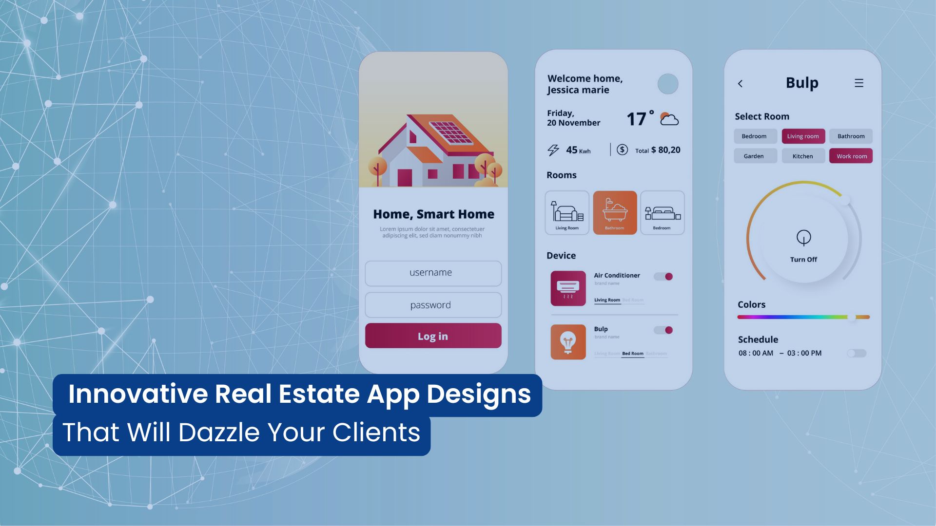

8 Innovative Real Estate App Designs That Will Dazzle Your Clients
Nowadays, In the real estate industry, potential buyers and sellers don’t solely rely on traditional...
Read More
25+ Web Design Trends That Will Dominate in 2025
Your website is the face of your brand. That is why it is important to maintain the website. As we a...
Read More
10 Website UX Mistakes That Are Costing You Clients (And How to Fix Them)
What if a potential customer lands on your website, excited about your products or services? But wit...
Read More
Decentralized UX: How to Design User-Friendly Web3 Apps
The blockchain revolution is reshaping how we interact with digital applications, but there's a majo...
Read More